Brochure Design of Meri Udaan
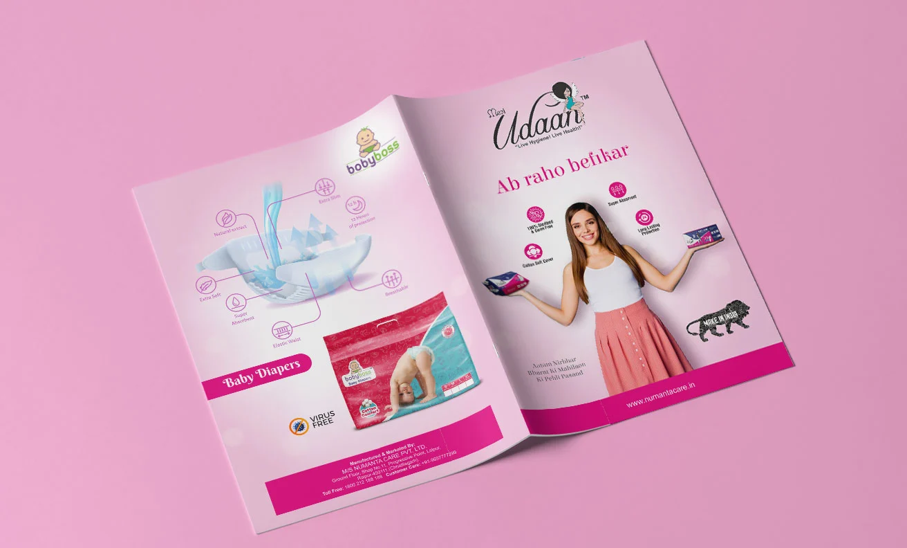
Artojar collaborated with Meri Udaan for designing a noteworthy brochure for them. Our team came forward with ideas that resonated the brand’s aesthetics as well as the industry type. To think something out of the box for them, we closely studied the brand’s specializations and their industrial domain. We opted for user-friendly colours considering the target audience and kept the brochure minimal including essential product related details with minimalist design elements to capture the viewer’s attention over the commodities.
- Meri Udaan
- Healthcare
- Beauty, Cosmetic & Personal Care
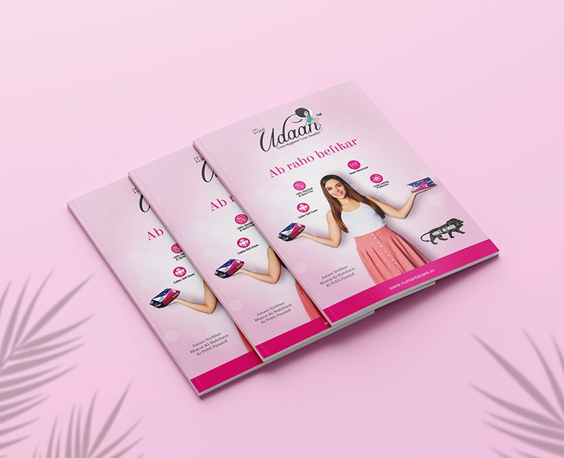


Our team of talented designers and content creators came up with a brochure design that was a perfect blend of design and description for the products showcased. We demonstrated the brand by employing eye-catchy colour palette and apt fonts to ignite customer’s interest leaving no aspect untouched. Utilizing a captivating colour scheme and purposeful fonts, we generated buzz among prospects, ensuring their immediate attention aligned with the company’s expertise. Every facet of the company’s capabilities was meticulously showcased, embodying our dedication to comprehensive representation.
We personified the brand’s knack by mentioning a catchy tagline for them. As Meri Udaan is an Indian originated brand, we didn’t miss on portraying their pride in making a brand that was initiated locally. Capturing their product qualities through pointers, we aimed to inspire trust and encourage potential partners to embark on their success story. We also included separate sections about the brand, the technology that they used for the manufacturing of their products and some keen specifications about their wares.


Our collaborative synergy with Meri Udaan proved fruitful and productive. Artojar's commitment to comprehensively grasp the client's needs and nurture the partnership led to tangible gains for the brand. If you seek an agency that delves deep into your business to amplify your potential, look no further – reach out to us today.
