Packaging Design of MZM
Designing MZM’s packaging was an immensely satisfying endeavor for Artojar. As a hub of Indian spices, our goal was to preserve the brand’s authenticity while infusing it with artistic flair. Our creation aimed to captivate customers, embodying the essence of MZM. Our packaging not only embodied the brand’s essence but also enticed customers, inviting them to explore more about the brand. Come witness this journey as we bring to life the vision of MZM through our designs.
- MZM
- Food
- Spices and Dry Fruits
- www.mzmasale.com


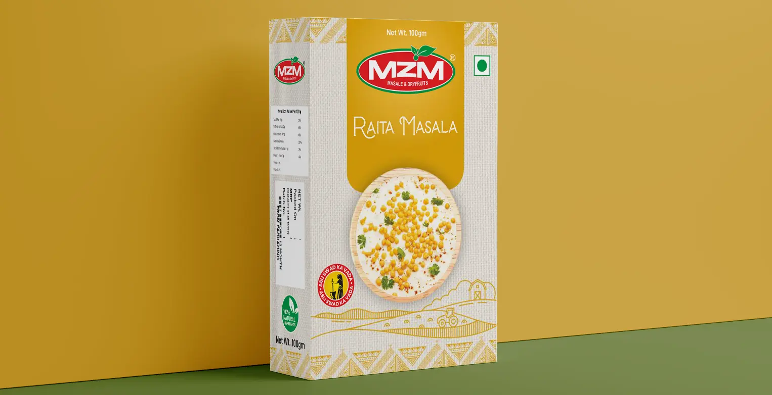
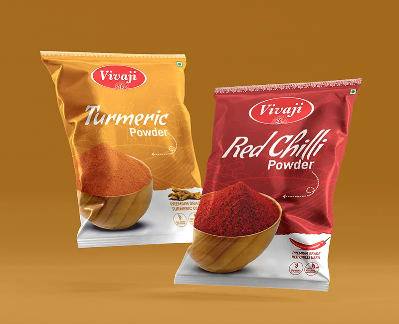
Commencing with the colour palette, we instinctively selected vibrant hues to harmonies with the rich Indian heritage of spices. Beyond colours, our design elements were tailored to each product, strategically enticing potential buyers. Our approach aimed to cultivate not only a taste preference but also an appreciation for visual appeal so we included intuitive skylines and elements that would enable the viewers to show keen interest in the product’s details. The deliberate infusion of vibrancy in our packaging design encourages lasting connections between MZM and the discerning Indian audience.
Our design complements both simplicity and elegance, spotlighting delectable products for immediate customer allure. Our team allocated ample room for MZM’s logo and a vegetarian mark, enhancing product comprehension. The minimalist packaging centers on logo, product, and colour theme, accented with aesthetic elements like skyline and abstract designs for visual appeal. Crucial details such as ingredients, components, product code, net weight and pricing along with the certification tags are discreetly positioned at the back of the box, exemplifying professionalism and captivating design. We were however able to amplify the brand with exclusive packaging design.


At Artojar, we delight in crafting engaging designs for our client, MZM, fostering long lasting connections. This project was an immensely joyful endeavour, as we curated vibrant packaging for their diverse product line in the spice industry. We crave elevating your brands and eagerly anticipate future collaborations, where fresh ideas meet the essence of your brand.


