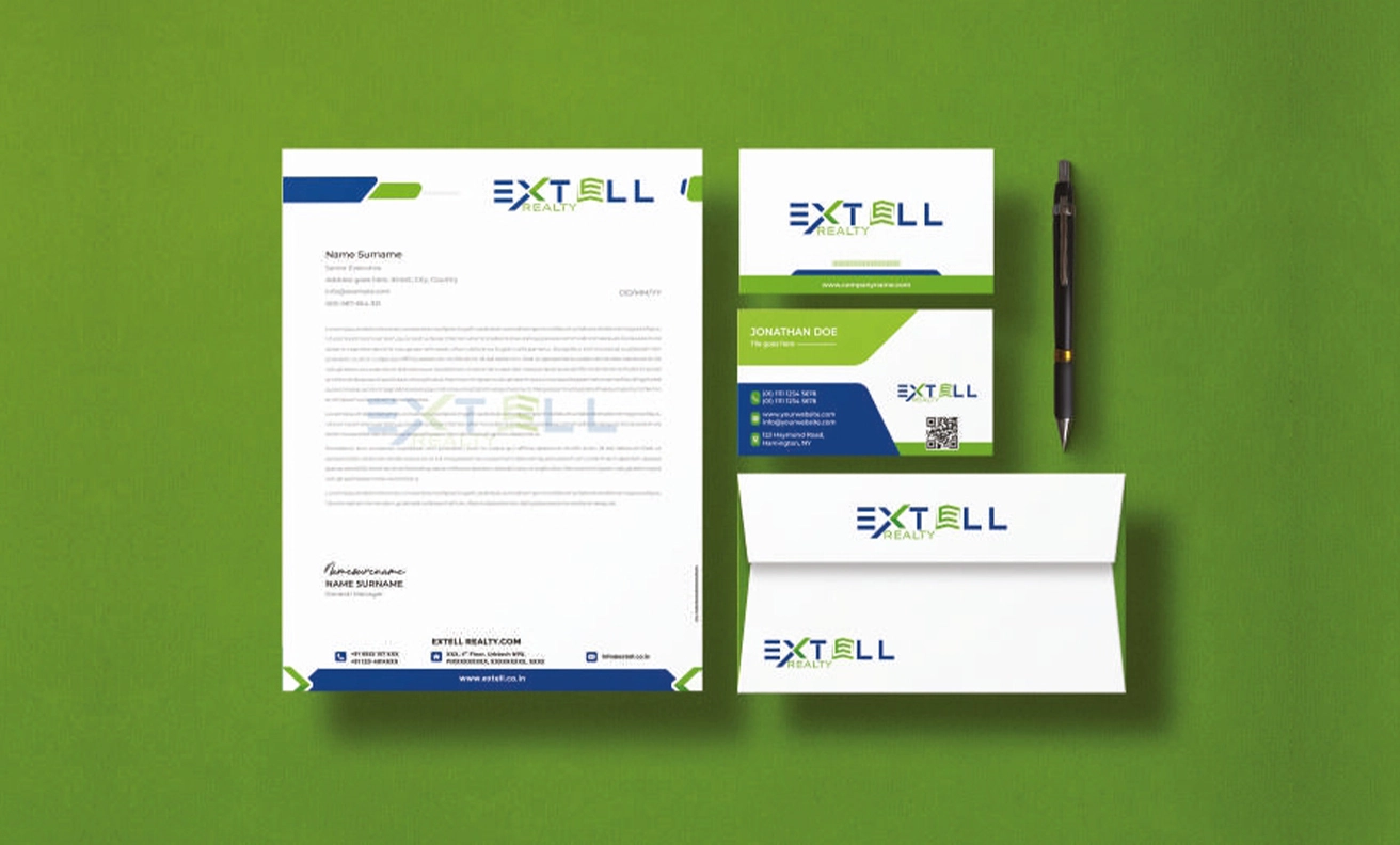
Logo Design of Extell Realty
We are thrilled to present our latest masterpiece: the logo design for Extell Realty. As a renowned design agency, we take pride in crafting unique visual identities that resonate with our clients’ brands, and Extell Realty is no exception. The Extell Realty logo is a harmonious blend of sophistication and simplicity, capturing the essence of the real estate industry. Our team of talented designers carefully considered every aspect of Extell Realty’s brand identity, ensuring that the logo reflects their core values and vision.
- Extell Realty
- Real Estate
- Real Estate Advisory

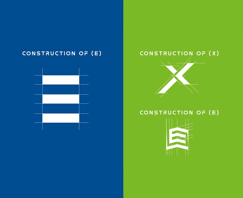
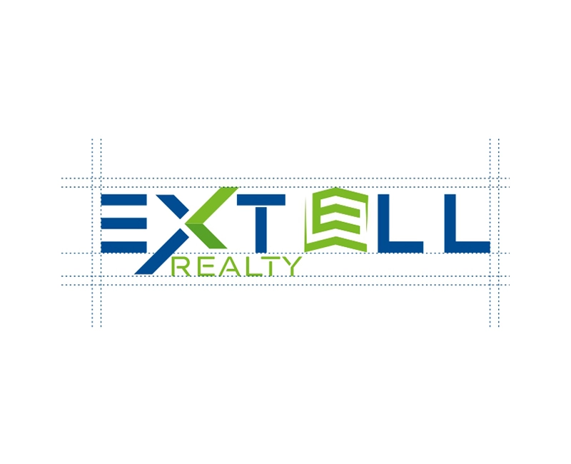
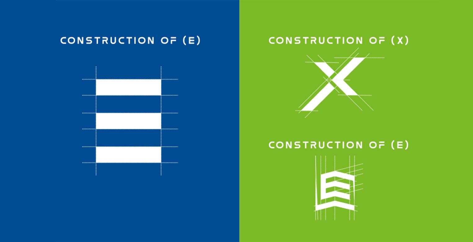
The central element of the logo is a stylized E and X, symbolizing the company’s expertise in real estate development. These subtle elements into the logo design to give it depth and meaning. E represents stairs of a real estate building. X denotes the forward and backward arrow to show buying and selling. Another E denotes the fascia of a real estate building.
It embodies professionalism, innovation, and trust, while also capturing the dynamic nature of the real estate industry. The logo’s typography is carefully chosen to complement the overall design. The bold, uppercase letters in a contemporary sans-serif font create a strong and memorable visual impact. The carefully balanced letter spacing ensures legibility and readability across various mediums.

We are proud to have collaborated with Extell Realty on this exciting project, and we believe that the logo we designed will serve as a strong visual anchor for their brand identity. If you're interested in learning more about our design process or exploring other projects in our portfolio, please feel free to browse through our website. We would be delighted to discuss how we can help you create a distinctive visual identity for your brand.
